
Help and Support » Features
Tool: Dynamic historams
The dynamic histogram tool is very powerful and can be dynamically adjusted. The tool also allows evaluation by tags (which day was used how often or how much training workload was marked accordingly) and by zones* (heart rate, pace, power).
( As usual, only the average values per activity are currently taken into account)
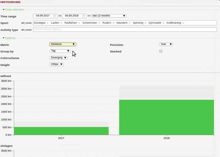
- Arbitrary choice of time span
- Arbitrary choice of sports and training types
- Summary of data: weekly, monthly or yearly
- Individual charts (or stacked bars) depending on sport, training type or day
- Alternative sports can be grouped
- Evaluation according to: Distance, duration, number of trainings, trimp, altimeter or zones
- Height and color scheme of the plot can be changed
The following must be considered:
- An evaluation by zones is only possible for one sport, as the zones differ depending on the sport.
- When tags are analyzed, activities (especially in the stacked variant) can be counted more than once if several tags are assigned to them.
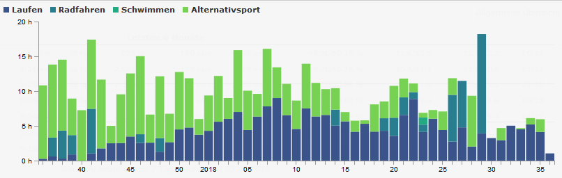
Histograms can be used to examine so many things. Among other things, the entire training workload can be examined by type of sport, as was previously possible in the weekly chart. The alternative sports can be easily grouped. In this example, it is easy to see how after a break running training has gradually replaced alternative training.
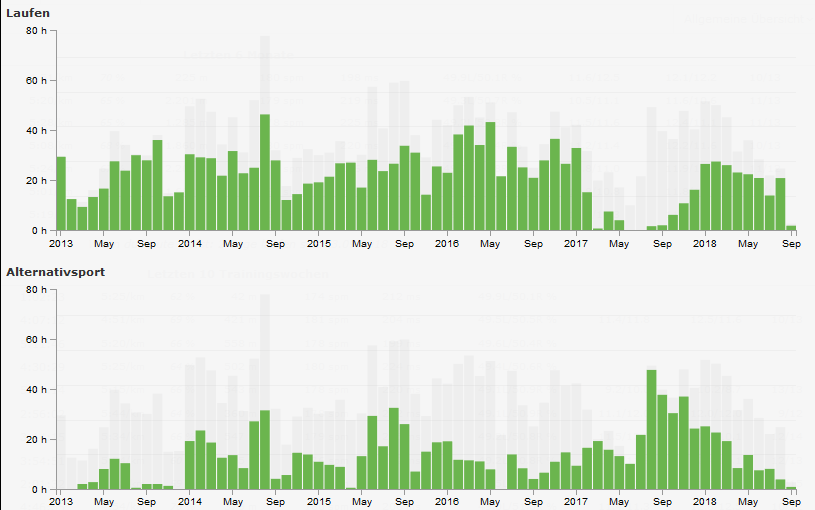
In addition to the common representation in a diagram, the representation in individual diagrams is also possible. The total value is displayed slightly grayed out in the background. In the following example, only running and alternative sports are included in the screenshot – this time as a monthly chart.
The last example is the evaluation by zones, in this case pace zones. As mentioned above and familiar from the analysis plugin, the evaluation unfortunately only takes the average values of the activities into account. Nevertheless, this evaluation can already show interesting details.

Related articles
Didn't find an answer to your question?
Please let us know if you have wishes or have encountered bugs. We give our best to make Runalyze as good as possible for you. - Therefore we would be interested in your suggestions for improvement. In general most questions, problems and ideas are more appropriate to ask in the forum.
 Follow us
